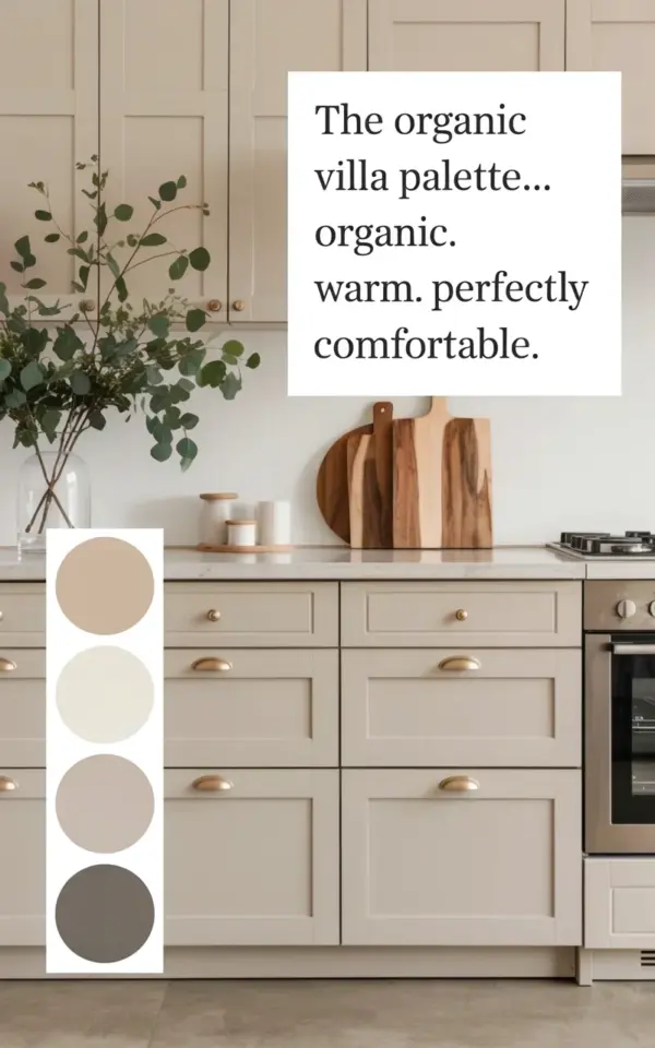
Those beige kitchen cabinets you just pinned? They might look completely different in your actual kitchen. And honestly, that little disaster is almost never the cabinet’s fault.
It’s the undertone. Picking beige for a farmhouse kitchen is a beautiful choice. It’s warm, approachable, and pairs gorgeously with wood and brass. But beige is a sneaky color. It can lean yellow, pink, gray, or even green depending on the light and the surrounding materials. If you choose a shade while staring at a tiny swatch in a brightly lit store, you’re gambling with your entire renovation budget.
Here’s the thing: that stunning mood board with the matte shaker cabinets and brass handles? It worked because the designer planned the undertones. They didn’t guess. You don’t have to be a professional designer to get this right. You just need to slow down and test like one.
Why Undertones Are the Real Battle in Farmhouse Kitchen Design
Beige is not a single color. It’s a whole family of colors that contain hidden pigments. These hidden pigments are the undertones, and they change how a color looks in different lights.
Warm beige has yellow or red undertones. It feels cozy and sunny. Cool beige has gray or green undertones, giving it a more muted, modern farmhouse vibe. When you see a beige that looks a little dirty or too pink, that isn’t a bad batch. It’s just an undertone conflict with the room around it.
When designing with wood and brass, like in that mood board with the wooden cutting board and those brass handles, you need to figure out if you want to match or contrast. If your beige has yellow undertones and your wood floor has yellow undertones, the whole room can feel monotonous and sickly. But if you pair a gray-toned beige with warm wood, you get a clean, balanced contrast.
How to Read the Undertone in Your Beige Samples
Ok so, pull out your paint swatches or cabinet samples. Look at them against a pure white piece of paper. That white background is your neutral referee.
If the beige looks golden next to the white, it’s warm. If it looks slightly dusty or cool, it’s gray-based. I always look at the edge of the swatch where the color meets the white. That’s where the truth lives. It helps to say the name of the undertone out loud. “This one is pink.” “This one is peach.” Naming it makes it impossible to unsee.
Here’s a trick I use when I’m struggling: hold up a piece of fresh eucalyptus. The green leaves from that vase in the mood board are a perfect litmus test. If the beige makes the green look vibrant, you’ve got a great warm-neutral match. If the green looks dull, your beige might be fighting with the cool tones.
The Right Place to Test Beige Kitchen Cabinets (It Is Not the Showroom)
Look, showroom lighting is engineered to make everything look perfect. It’s usually bright, direct, and warm. Your kitchen is not a showroom. Unless you have skylights and track lighting in a perfect grid, you’re working with different light conditions.
You need to bring your samples home. That’s the only way to see how they interact with your specific walls, floors, and natural sunlight. Don’t just test them on the counter either. Put them in the shadowy corner by the pantry. Prop them up vertically against the backsplash because that’s how they’ll sit in the room.
And please, wait for the light to change. Check them at noon, check them at 6 pm, and check them at night. The color will literally shift. It might look like a perfect greige in the morning and a sad, tired yellow at night. Don’t let that happen to you.
Which Undertone Complements Your Countertop and Floor?
Before you fall in love with a specific shade of beige, figure out what’s staying in the kitchen. Your countertop and flooring are non-negotiables. They have colors, patterns, and undertones that you can’t change easily.
If your counters are white with gray veining, you want a beige with a cooler, grayer undertone. This creates a smooth, seamless look. If your counters are cream or buttery, you want a warmer beige with yellow or gold undertones. The worst mistake is mixing a pink beige with a yellow counter. It creates a muddy, chaotic clash that’s hard to fix.
I always recommend pulling large samples of the materials you already own. A small countertop tile or a floor plank placed next to your cabinet sample will tell you more than any mood board ever could.
Matte Shaker Cabinets and Brass Handles: A Mood Board Reality Check
That mood board visual is a lovely mix of natural textures, from the matte finish on the shaker doors to the wooden cutting board. Matte finishes are forgiving. They don’t reflect harsh light, so they downplay some undertone issues. Glossy finishes magnify everything.
Brass handles are a classic farmhouse pick. But brass is also a color. Warm brass pulls out the yellow undertones in your cabinets. Brushed nickel or chrome pulls out the gray and cool tones. If you’re truly going for that exact mood board look, you need to accept the warmth that comes with brass and pick your beige accordingly.
A matte beige cabinet with warm yellow undertones and brass handles becomes a very golden room. It can feel heavy. A matte beige with a slight gray undertone and brass handles creates a more modern elegance. That’s how you get the farmhouse look without turning your kitchen into a hay bale.
My Honest Take on Building a Beige Kitchen Palette
I’ve seen so many people get stuck obsessing over the exact shade of beige that they forget the rest of the room. The wall color, the backsplash tile, and even the color of your eucalyptus decor all contribute to the final look. Beige doesn’t exist in a vacuum.
The easiest way to build a palette is to start with your cabinet color as the anchor. Then, choose two neutrals that support it. A creamy white for the ceiling or trim, and a slightly darker gray for an island or a pantry door. In that mood board, they used a circular palette with beiges, creams, and grays, which is exactly the right ratio.
Here are the quick rules I live by when working with beige:
– Always test at least three shades, never just one.
– Compare your samples with white paper, never with bare eyes against a busy floor.
– Match the “temperature” of your beige to the temperature of your hardware.
– Use a fresh element like eucalyptus to check if your neutrals feel alive or flat.
– Trust the color in your kitchen, not the color under the store lights.
If you do all that, you can’t go wrong. You might even be surprised by which shade ends up being the winner. It rarely is the one you thought you loved in the showroom.
Your Kitchen, Your Beige, Your Relief
Choosing beige doesn’t have to be a stressful minefield. It just takes a little patience and a lot of comparing swatches side by side. Once you find that perfect shade, the one that makes your wood counters pop and your brass hardware sing, it will all feel worth it.
Have you found a beige you’re loving right now? I’d genuinely love to know what shade made the final cut for your space.
Leave a Comment